Fiber Content: 100% Mercerized Cotton
Weight: Lace
Crochet Gauge: #10 Crochet Thread
Yards: 721
Grams: 100
Put Up: Ball
Care: Hand Wash Cold / Lay Flat to Dry
Weight: Lace
Crochet Gauge: #10 Crochet Thread
Yards: 721
Grams: 100
Put Up: Ball
Care: Hand Wash Cold / Lay Flat to Dry
Curio #10
$5.99
$4.79 - $5.99
/ 100g ball
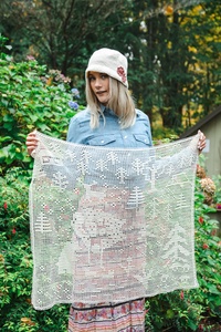
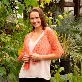
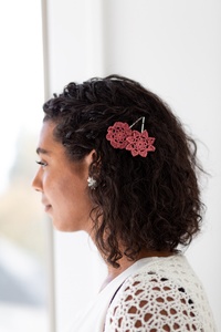
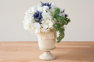
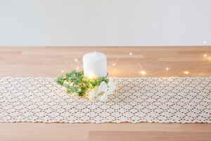
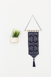
Lustrous, elegant, and versatile—Curio is sure to be your favorite new crochet thread! This mercerized, 2-ply #10 crochet thread is available in a brilliant range of shades: a selection of rich reds, blues, greens, and yellows are accented with soft pinks and purples as well as dreamy sky blues and sea foamy greens. Rounding out this palette of traditional and delightfully unexpected hues is a lovely selection of neutrals and basics like black and white. This luxe #10 crochet thread is ideal for crocheted home décor items such as doilies, coasters, tablecloths, curtains, and more. A crisp stitch definition highlights intricate stitches and textures with a lustrous sheen. And don’t forget, you can use Curio for crocheted lacework as well!
{{ props.errorMessage || props.successMessage }}
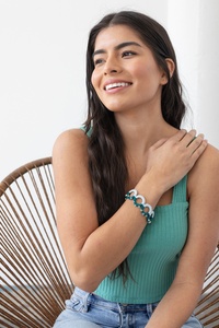
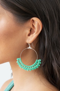
Bahama is a green blue color that shines with neon intensity. A bold color, it has more green than turquoise and is more vibrant than teal. Use it in your next project to add a splash of color.
Blue is a true medium blue. It is the perfect shade of blue that compliments a range of colors from neutrals to pastels. Slightly deeper in tone than an ocean blue, it is a must to have in your yarn stash.
Ciel is a stormy medium blue with muted grey undertones. With subtle hints of steel blue and an understated cornflower, Ciel is a lovely blue that is that soft and refined. Use this with other muted colors for a soft color palette or use it in a gradient of dramatic blues.
Clarity is a very light powder blue color with an ever so subtle hint of green. This versatile color makes a lovely contrast against a variety of colors.
Navy is a deep, dark blue color. One of the darkest shades of blue, Navy can be mistaken for black at a quick glance. This rich color will add a classic color scheme for your next project.
Kenai is a vibrant turquoise color. It is representative of the deep rich colors that combine to make the eye-catching colors of our oceans and rivers.
Sagebrush is a delicate seafoam color, somewhere in between a soft blue and green. This soft color was warm, grey undertones which makes it pair with cooler and warmer tones.
Jalapeno is a medium yellow-green with black undertones. Reminiscent of the color of a jalapeno pepper, it will have you hopping with excitement.
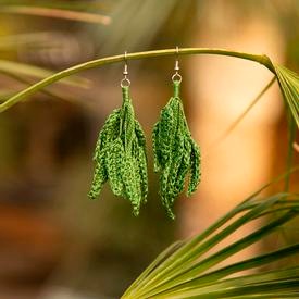
Lichen is a lush, mossy green colorway with soft hints of olive and yellow. The warm undertones allow Lichen to go with other warm neutrals but it also shines when paired with bright and vibrant blues.
Mmm. This yarn is the color of a double scoop of pistachio gelato. Pistachio is a cool mint green yarn that lets you create ice cream inspired combinations.
A vibrant yellow, Canary will remind you of daffodils and schoolbuses. It has a slight green undertone for a more modern yellow that pairs beautifully with neutrals like grey and cream.
Turmeric is a brownish, orange yellow color. Inspired by the golden tones of spices found in South Asia, Turmeric will become a favorite color to use in your fall wardrobe.
Clementine is a muted yellow orange with a slight grey undertone. Named after the Clementine Orange, this color is as delectable as its namesake.
Colonial Rose is a tribute to a non-conventional rose color, named for the historic natural specimen. It is a tribute to a floral, sunny colorway that incorporates hues of peach, yellow and reds. Colonial Rose pairs well with warm colors and complements cooler shades.
A gorgeous peachy coral, Conch is vivid and summery, perfect for garments with a poolside vibe. This bright color has cool pink undertones for stunning, eye-catching projects.
Copper is an earthy reddish brown color. It is darker and has more brown than red iron oxide does but features more red than a light cinnamon tone. A rich color that is perfect for fall and looks great with neutrals and other earthy tones.
Hollyberry is a rich berry red color. A close resemblance to burgundy, Hollyberry is a jewel tone that looks fabulous when combined with dark colors or with lighter shades.
Serrano is a fiery red color. Named after the Serrano Pepper, it is sure to spice up your knitting projects. It pairs up beautifully with neutrals as a focal or accent color.
Soft and sophisticated, Tea Rose is a dusty rose color with muted undertones. A color with timeless elegance, Tea Rose has warm undertones with subtle hints of puce.
Comfrey is a muted lavender with warm undertones that has an understated elegance to it. In addition to hints of dusty plum and stormy wisteria, Comfrey a lovely color that pairs well with other muted colors and soft pastels.
Eggplant is a medium royal purple color. This cool, blue-violet shade reminds us of a juicy batch of fresh purple grapes as well as the rich purple tones of the vegetable it is named after.
A delicate pinkish purple color, Heliotrope is a lovely pastel that reminds us of the purple and violet tones found in the beautiful blooms of the fragrant perennial.
Mongoose is a creamy medium brown. Not as light as a milk chocolate, but resembles the color of espresso. A rich color that looks great with darker brown, oranges, and greens for a classic fall combination.
Black is a true black and looks great with anything. Use it as an accent color in your favorite pattern or by itself.
Hawk is a graphite grey color. Dark in tone, Hawk is also very close to the color of steel and is neutral enough to work with a range of colors.
Whisker is a warm light grey color with a slightly brown undertone. This soft neutral will make jewel tones pop and pastels shine. Combine with other neutrals for a beautiful tonal themed project
White is a pure snow white color. A true neutral it will go with any color palette as an accent or focal color.
An undyed version of Curio, Bare is wonderful to use on its own or simply as a complement to any of the other shades. A warm beige, Bare also works wonderfully to tone down brighter shades.
Bahama
SKU: 27982
$5.99
$4.79
20% off
Blue
SKU: 27977
$5.99
Ciel
SKU: 26268
$5.99
Clarity
SKU: 27970
$5.99
Navy
SKU: 26261
$5.99
Kenai
SKU: 27978
$5.99
Sagebrush
SKU: 26267
$5.99
Jalapeño
SKU: 27979
$5.99
Lichen
SKU: 26271
$5.99
$4.79
20% off
Pistachio
SKU: 27968
$5.99
$4.79
20% off
Canary
SKU: 27972
$5.99
Turmeric
SKU: 27967
$5.99
Clementine
SKU: 27974
$5.99
$4.79
20% off
Colonial Rose
SKU: 29879
$5.99
Conch
SKU: 27976
$5.99
Copper
SKU: 27973
$5.99
Hollyberry
SKU: 26259
$5.99
Serrano
SKU: 27971
$5.99
Tea Rose
SKU: 26265
$5.99
Comfrey
SKU: 26264
$5.99
Eggplant
SKU: 27980
$5.99
$4.79
20% off
Heliotrope
SKU: 27981
$5.99
Mongoose
SKU: 26263
$5.99
Black
SKU: 26258
$5.99
Hawk
SKU: 27969
$5.99
Whisker
SKU: 27975
$5.99
White
SKU: 26255
$5.99
Bare
SKU: 26254
$5.99